Brand re-design for Diakonie Leipzig

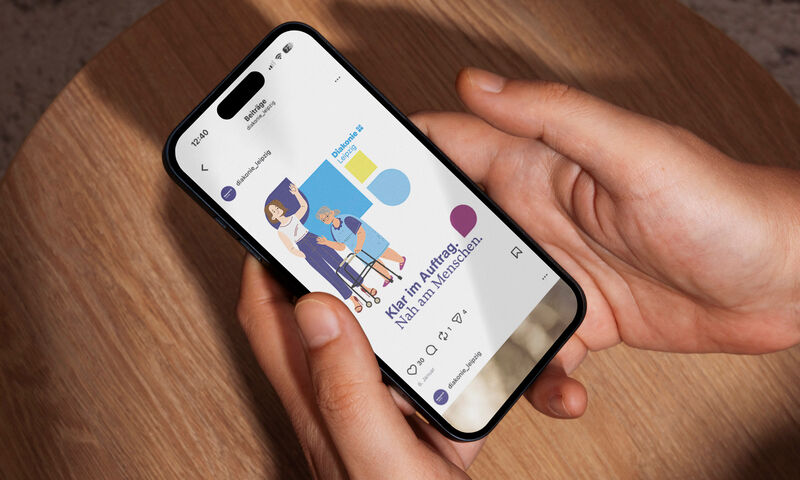
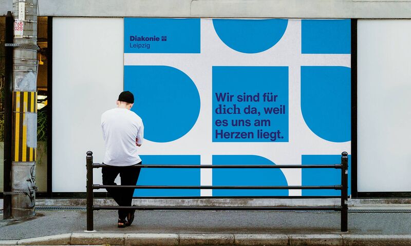
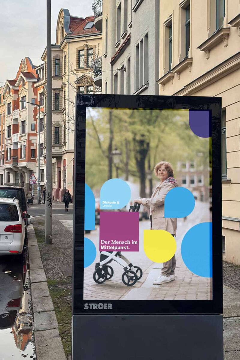
A Voice for Neighbourly Love

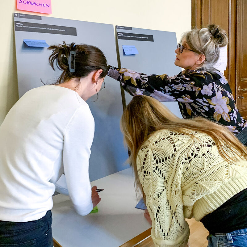
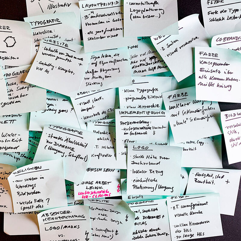
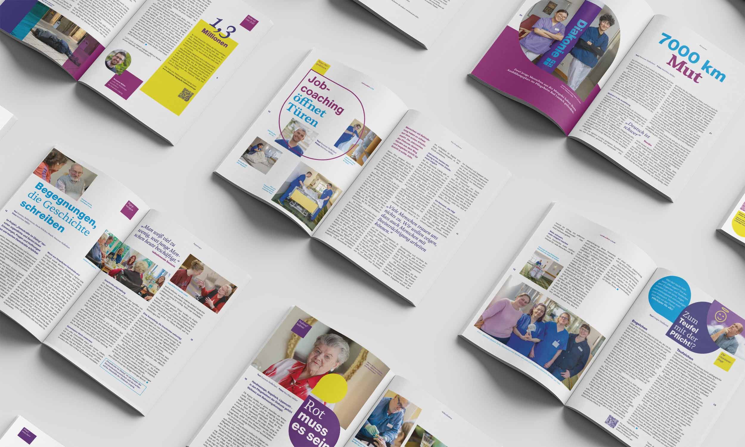
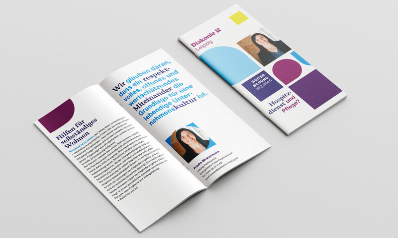
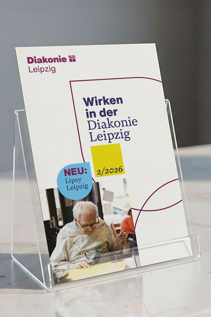
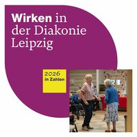
From March 2025 to April 2026, Kollaborat worked together with Diakonie Leipzig on a new corporate design. The existing visual identity had fallen short in several areas, and the redesign was intended to finally do justice to the breadth and humanity of the organisation — giving it a clear, vibrant and recognisable presence for the future.
Diakonisches Werk Innere Mission Leipzig e.V. is one of the oldest social organisations in the city. For over 150 years it has shaped the social fabric of Leipzig — with more than 1,500 employees and over 50 facilities. Its work spans elderly care and nurseries, disability support and inclusion, through to counselling and support services for people in difficult circumstances.
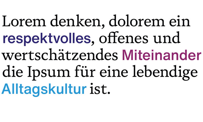
Diakonie Leipzig acts from a clear conviction: neighbourly love is not a programme — it is lived every day.

Too Dark for So Much Light

What Diakonie Leipzig achieves is extraordinary. Its visual identity had long failed to reflect that. The appearance was too dark, too cluttered, too restless.
A joint design workshop brought the issues into sharp focus: a confusing proliferation of project logos, an outdated image world, typographic inconsistency and a colour palette that concealed the organisation's warmth rather than conveying it.
Early external surveys confirmed it: the brand was recognised — but not as a strength.

Lipsy, Novela and a Fresh Yellow

At the heart of the solution is a new design element: the Lipsy. It is derived directly from the traditional crown cross of the Diakonie parent brand — organic and geometric, rounded yet angular, and at the same time a reference to the linden leaf that lies etymologically within the name Leipzig.
From a familiar emblem, something new emerges: a personal, approachable and flexible element that offers far greater creative possibilities than the previous principle.
The existing Helvetica gives way to the modern Helvetica Now — complemented by the humanist serif typeface Novela. This typographic mix creates deliberate contrast: clarity meets empathy, structure meets humanity. The colour palette has been decisively refined. The familiar blues and violets remain, but are joined by a fresh, vibrant yellow that signals energy and openness — and lifts the whole identity out of the dark.

More room to breathe, more coherence

The result is a living design system: greater creative variety, more flexibility for the many different areas of Diakonie Leipzig — and yet a clear, unmistakable coherence throughout. With a practical style guide and ready-to-use templates, the new visual identity is firmly embedded in the organisation's day-to-day work. An investment with lasting impact — for a brand that now reflects, visibly and confidently, what Diakonie Leipzig truly means to this city.

Project Facts

Period: March 2025 – April 2026
Client: Diakonisches Werk Innere Mission Leipzig e.V.
Scope: Corporate design redesign, style guide, template creation, signage, brand training, brand consultancy
Team: Joey Förster, Jakob Gleisberg, Hendrik Möller, Johannes Naumann
www.diakonie-leipzig.de